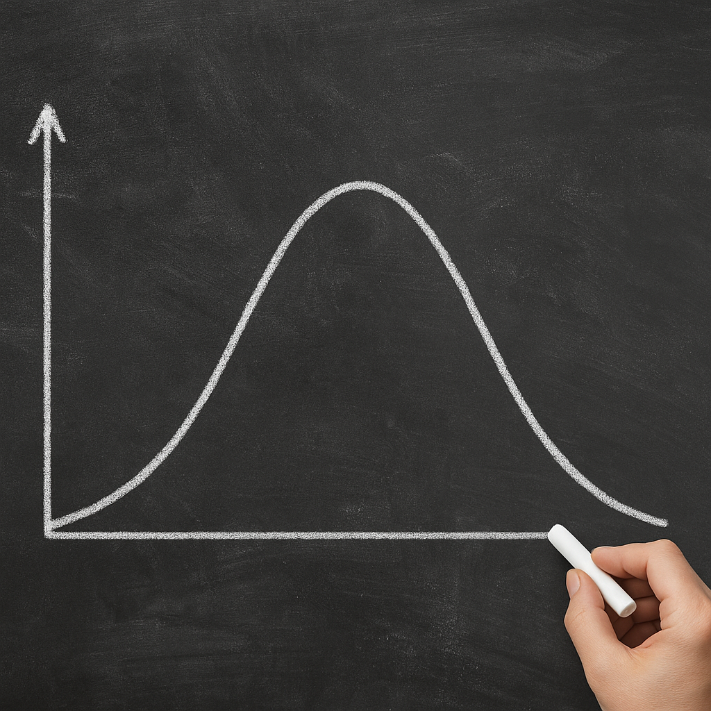
The bell curve stands as one of the most recognizable shapes in statistics, symbolizing the distribution of countless natural and social phenomena. Its smooth, symmetric arch conveys a sense of balance and predictability, yet its subtleties reveal layers of complexity that statisticians, scientists, and decision-makers must navigate carefully. The following exploration delves into the origins, mathematical underpinnings, practical uses, and pitfalls of this iconic normal distribution.
History and Origin of the Curve
Early insights into patterns of error and variation predate the formalization of the Gaussian curve. In the 18th century, Abraham de Moivre noted that as the number of trials in games of chance increased, the distribution of outcomes approached a smooth, symmetric shape. Later, Carl Friedrich Gauss applied similar reasoning to the study of astronomical errors, giving rise to the term Gaussian distribution. Over time, the curve became synonymous with the idea that many influences, when aggregated, produce a characteristic pattern.
The trajectory from anecdotal observation to rigorous theory involved several key milestones:
- De Moivre’s approximation of the binomial distribution for large samples.
- Gauss’s work on the method of least squares, which assumed errors followed a symmetric, bell-shaped pattern.
- Laplace’s formal proof of the central limit theorem in a broad context.
By the 19th century, universities across Europe and North America were teaching the bell curve as the centerpiece of statistical inference. Its universality became a metaphor not only for physical measurements but also for human traits like height and, controversially, intelligence scores.
Mathematical Foundations
At the heart of the bell curve lies a concise mathematical expression. The probability density function (PDF) for a normal distribution is defined as:
f(x) = (1 / (σ √(2π))) · exp(−(x − μ)² / (2σ²))
Here, μ denotes the mean—the central location—while σ represents the standard deviation, measuring spread. The area under the entire curve equals one, ensuring it qualifies as a valid depiction of probability. Key properties include:
- Symmetry around the mean: P(X − μ > k) = P(μ − X > k).
- Empirical rule: Approximately 68% of values lie within 1σ, 95% within 2σ, and 99.7% within 3σ.
- Moments: The first moment is μ, the second central moment is σ², while all higher odd moments vanish.
Central Limit Theorem
One of the most profound results in probability theory, the central limit theorem (CLT), explains why the bell-shaped curve appears so often. It states that when independent random variables with finite variance are summed, their normalized sum approaches a normal distribution, regardless of the original distributions. This theorem underpins much of modern inference:
- Sampling distributions of means become approximately normal for large sample sizes.
- Confidence intervals and hypothesis tests rely on this asymptotic behavior.
Without the CLT, the neat frameworks of many statistical procedures would collapse, and we’d lose the simplicity afforded by the bell curve.
Practical Applications
The ubiquity of the bell curve across disciplines attests to its versatility:
- Quality Control: Manufacturing processes use control charts based on normal limits to detect anomalies.
- Standardized Testing: Test scores are often scaled to fit a normal distribution, aiding comparisons.
- Finance: Models of asset returns and portfolio risk assume — sometimes optimistically — normal behavior.
- Biological Measurements: Traits such as height, blood pressure, and testicular volume in mammals follow approximate normal patterns.
In business analytics, decision-makers apply probability thresholds derived from the curve to distinguish between typical and atypical outcomes. Medical researchers use confidence bands around mean responses to evaluate treatment effects. Even in psychology, the concept of average behavior relies on the curve’s symmetry.
Yet real-world data often deviate subtly from the ideal. Small irregularities in the tails can profoundly affect the estimated risk of extreme events. Therefore, professionals continuously test for skewness and kurtosis to confirm whether the normal model holds or if alternative distributions are more appropriate.
Common Misconceptions and Limitations
Despite its power, the bell curve can be misused when practitioners overlook its assumptions:
- Assuming perfect symmetry can blind analysts to skewness in data, leading to underestimation of tail risks.
- Relying on normality to justify parametric tests without verifying fit introduces potential bias.
- Attributing causation based on correlational patterns within a normal framework ignores lurking variables.
Another frequent error lies in interpreting percentiles mechanically. For example, labeling individuals as “above average” or “below average” ignores that the normal curve is continuous—no sharp boundaries delineate categories. Similarly, using the curve to assign grades or social status can perpetuate stereotypes and ignore individual variability outside the linear framework.
When data exhibit heavy tails or multimodal tendencies, alternative distributions (e.g., t-distribution, log-normal, or mixture models) offer better fidelity. In sensitive fields such as finance, insurance, or climate science, misjudging tail probabilities by assuming normality can yield disastrous consequences, from underpricing risk to overlooking rare catastrophes.
Overall, while the bell curve remains an elegant cornerstone of statistical practice, mastery requires discerning its scope and respecting its constraints. By coupling theoretical insight with empirical checks, analysts can harness its predictive power without succumbing to oversimplification.